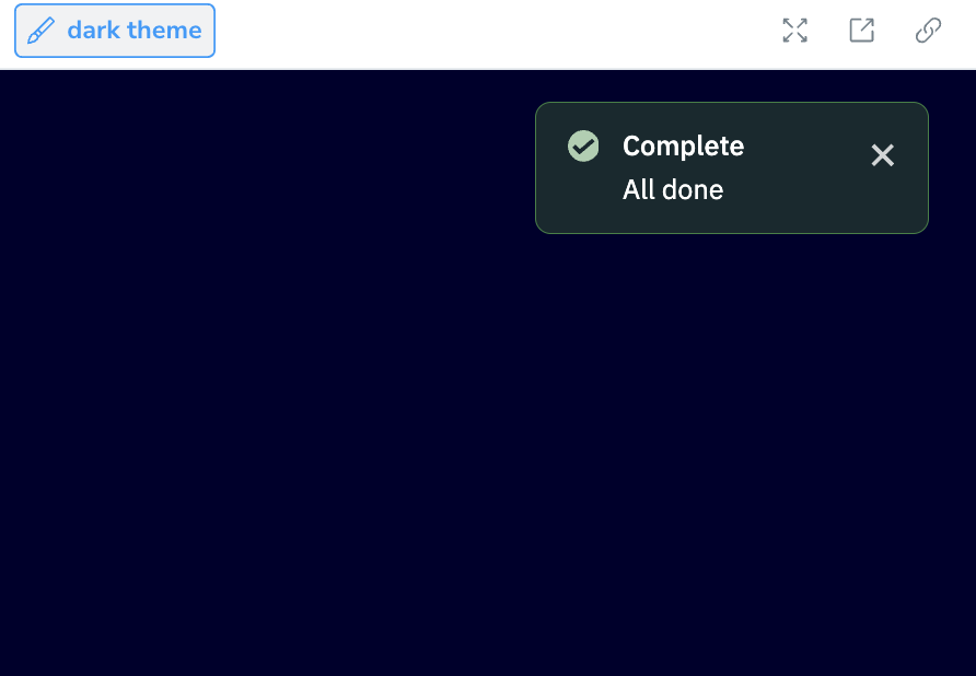
Banner
ActiveCampaign’s static banners are persistent, non-obtrusive messages that sit inline with the page or modal content. They can be used for education, to let a user know that something in the system has changed, or to generally let the user know about a message that’s important to their workflow within ActiveCampaign.
Loading...
Loading...
@camp/banner exports a single Banner. It is the themed, styled-components implementation that used to ship as AiBanner, extended with every prop the earlier CSS-module Banner supported, so both sets of callers move to it without losing functionality. See Upgrading for what changed for each.
Overview
Resources
Install
yarn add @camp/bannerProps
| Prop | Type | Default | Description |
|---|---|---|---|
title | ReactNode | — | Title content. Rendered as a heading element when `headingLevel` is set, otherwise as text. |
appearance | "warning" | "destructive" | "info" | "educational" | "success" | "upgrade" | "ai" | "danger" | info | Colour, border and icon treatment. `danger` is accepted as an alias of `destructive`. |
description | ReactNode | (() => ReactNode) | — | Description content. A string is rendered with the banner's body typography. Any other `ReactNode`, or a render function (invoked as a component, for callers of the pre-consolidation API), is rendered as-is inside a structural wrapper and keeps the typography and color its consumer gave it. |
actions | () => ReactNode | — | @deprecated Use `renderActions`. Kept for callers of the pre-consolidation `Banner`. |
descriptionTestId | string | — | |
small | boolean | false | Compact banner: renders the description only, at the smaller body size. The title, icon, actions and dismiss control are not rendered. |
dismissLabel | string | — | Accessible label for the dismiss control. Defaults to the platform's translated `global:dismiss` string, so it only needs to be set to override that copy. |
onDismiss | () => void | — | When provided, renders a dismiss "X" control that fires this callback. |
titleTestId | string | — | |
headingLevel | 1 | 2 | 3 | 4 | 5 | 6 | — | Renders the title as `h1`–`h6` so it takes part in the page outline. Does not affect the title styling. When omitted the title is plain text. |
actionsTestId | string | — | Applied to the wrapper around the rendered actions. |
dismissTestId | string | — | |
key † | Key | — | |
id † | string | — | |
flush | "top" | "bottom" | — | Squares off one edge so the banner sits flush against the element above or below it. |
hideIcon | boolean | false | Hides the appearance icon. |
renderActions | () => ReactNode | — | Render function for action buttons, placed under the description (or inline when there is none). |
themed | boolean | true | `true` (default) follows the surrounding light/dark theme context and requires a `ThemeProvider`. `false` pins the light theme for every styled part of the banner, including the dismiss control, so a light-only screen renders without a provider. |
toastStyles | boolean | false | Adds the elevation-2 shadow used when a banner is presented as a toast notification. |
Generated from @camp/banner@6.24.0 source, ordered by production usage. * required. † standard HTML attribute — all native attributes are supported; only those with production usage are listed.
Upgrading
The consolidated Banner is a major release of @camp/banner. What changes depends on which component you are coming from.
From AiBanner
| Before | After |
|---|---|
import { AiBanner } from '@camp/banner' | import { Banner } from '@camp/banner' |
Always rendered with role="alert" | No default role; pass role="alert" where the banner announces a dynamic message (Toast does this) |
actionsTestId was accepted but not applied | actionsTestId lands on the wrapper around your rendered actions |
Everything else (appearance, title, description, hideIcon, onDismiss, renderActions, flush, test IDs) is unchanged.
From the previous Banner
| Before | After |
|---|---|
| CSS-module styling, light only | Refreshed styled-components visuals that follow the surrounding theme by default (themed defaults to true and needs a ThemeProvider); pass themed={false} to keep a light-only screen working without one |
title rendered as an h3 by default | title renders as text unless you pass headingLevel; pass headingLevel={3} to keep the heading |
dismissLabel required whenever onDismiss set | Optional; the dismiss control is labelled with the platform’s translated global:dismiss unless you override it |
actions | Still works; prefer renderActions |
appearance="danger" | Still works and renders the destructive banner; prefer destructive |
description as string or render function | Still works; any ReactNode is now accepted too |
small, headingLevel, toastStyles, ai | Unchanged |
From Camp 1
If you are still on @activecampaign/camp-components-banner, replace the import with Banner from @camp/banner, pass actions (or renderActions) as a render function, and keep appearance="destructive" as is; there is no longer a rename to danger.
Variations
Appearance
Below are the appearance variations available in Banner and the use case for each.
- Info (default): Provides additional information to the user
- Educational: Provides educational content, oftentimes linking to Learn or Help docs
- Success: Indicates successful completion of an action
- Upgrade: Indicates that additional functionality is available via upgrade
- Warning: Indicates that something will become an error (or expire) soon
- Destructive: Indicates an error (
dangeris accepted as an alias) - AI: Indicates actionable insights generated by or available via AI, drawn with the gradient border and icon
Values outside this set fall back to info, so a banner never renders without a background.
Loading...
Loading...
Loading...
Loading...
Loading...
Loading...
Loading...
import { Banner } from '@camp/banner';

<Banner
  title="This is a title"
  description="Lead Scoring is a flexible, powerful tool that empowers marketers to apply a points system for contact action, or inaction, based on what's important to an organization. Read our lead scoring guide, or listen to our podcast."
  appearance="success"
/>;
Theming
themed defaults to true: the banner follows the surrounding light/dark theme context, which requires a ThemeProvider in the tree. Pass themed={false} to pin the light theme for every part of the banner, including the dismiss control, so a light-only screen renders without a provider. Theme-aware by default is where every Camp component is heading; Banner is one of the first to make the switch.
import { Banner } from '@camp/banner';

// Follows the active theme; needs a ThemeProvider (the default)
<Banner appearance="info" title="Follows the surrounding theme" />

// Pinned to the light theme, no ThemeProvider needed
<Banner appearance="info" themed={false} title="Always light" />
Size
Banners come in two sizes, the default medium size and a small size. Which size to use is based on both the importance of the communication as well as the context of where it is placed. In most cases, the medium banner should be used, but the small banner is a good alternative for:
- Banners inside components, such as modals, drawers, and cards
- Paired with smaller blocks of content on the page that are lower in hierarchy
The small banner renders the description only, at the smaller body size. The title, icon, actions and dismiss control are not rendered. small is a boolean.
Loading...
<Banner
  description="Lead Scoring is a flexible, powerful tool that empowers marketers to apply a points system for contact action, or inaction, based on what's important to an organization. Read our lead scoring guide, or listen to our podcast."
  small
/>
Heading level
By default the title is plain text. Set headingLevel to render it as h1 to h6 so it takes part in the page outline. The level does not change the styling.
Loading...
<Banner
  appearance="educational"
  headingLevel={2}
  title="Rendered as an h2"
  description="Pick the level that fits where the banner sits in the document."
/>
Title or description only
Both title and description are optional. Without a description, the title, any actions and the dismiss control align inline. A description-only banner with a dismiss control reserves room so the text never sits under it.
<Banner title="This is a title" onDismiss={handleDismiss} />

<Banner description="This banner only has a description without a title." onDismiss={handleDismiss} />
Without icons
Hide the appearance icon by setting hideIcon.
<Banner
  appearance="warning"
  title="Warning without icon"
  description="Warning banner with hideIcon enabled."
  hideIcon
/>
Dismiss
Provide an onDismiss callback to render a dismiss control. It is an AI Icon Button with the transparent appearance and follows the banner's themed value. Its accessible name is the platform's translated global:dismiss string; pass dismissLabel only to override that copy.
<Banner
  appearance="info"
  title="Dismissible banner"
  description="This banner can be dismissed by clicking the close button."
  onDismiss={() => console.log('Banner dismissed')}
/>
Actions
Add action buttons through the renderActions render function. The banner wraps them, spaces them and applies actionsTestId to the wrapper, so return the buttons directly. Use small buttons and, on a themed banner, the AI Button so they follow the theme.
import { Banner } from '@camp/banner';
import { AiButton } from '@camp/ai-button';

<Banner
  appearance="upgrade"
  title="AI recommendation available"
  description="New AI-powered features are available to enhance your workflow."
  onDismiss={() => console.log('Banner dismissed')}
  renderActions={() => (
    <>
      <AiButton appearance="primary" size="small">
        Upgrade now
      </AiButton>
      <AiButton appearance="secondary" size="small">
        Learn more
      </AiButton>
    </>
  )}
/>;
Flush
Set flush="top" to square off the top edge and drop the top border so the banner attaches to the element above it, for example directly under a chat input. flush="bottom" does the same for the bottom edge.
<Banner appearance="info" flush="top" title="Sits flush against the top edge" />

<Banner appearance="info" flush="bottom" title="Sits flush against the bottom edge" />
Toast styles
toastStyles adds the elevation-2 shadow used when a banner floats as a notification. You rarely need it directly: Toast renders Banner for you.
Usage
Best practices
- A maximum of 2 actions can be placed in the banner, although it is recommended to keep it consolidated to a single action to narrow focus of the banner's purpose. Rather than any "dismiss"-type button actions, use the dismiss indicator in the corner instead.
- Banners should not be dismissable if they have any critical information or important information that the user might need. If it's something that they wouldn't want to dismiss on accident, it should not have a dismiss indicator. Warning and destructive banners should never have a dismiss indicator.
- Banners should be placed above their area of context, rather than below or between blocks of content. A banner should appear until its conditions are met and shouldn't overstay its welcome. For example, once a user has successfully onboarded a new feature, they should no longer see the related educational banner.
Content guidelines
Banner titles are written clearly in sentence case and in complete sentences, with no punctuation at the end. Write banner titles so that they can be easily translated into different languages. Banner descriptions should be written in full and complete sentences, with punctuation at the end.
Accessibility
Keyboard support
- When there is a dismiss indicator, move focus to it using the
tabkey - When there are banner actions, move focus to them using the
tabkey - On either the dismiss indicator or banner actions, use the
spaceorenterkey to perform action
Labels and semantics
- Set
headingLevelwhen the title should take part in the page outline; without it the title is plain text. - The dismiss control and the appearance icons carry translated labels. Pass
dismissLabelonly to override the dismiss copy. - The banner has no ARIA role by default because most banners are static page content. When a banner appears in response to something the user did, pass
role="alert"(orrole="status"for less urgent messages) so it is announced.