

Combobox
A powerful dropdown for providing suggestions, filtering out large datasets, and creating new values quickly and efficiently with no overhead.
Loading...
Loading...
Overview
Resources
Install
yarn add @camp/comboboxProps
| Prop | Type | Default | Description |
|---|---|---|---|
inputAriaLabel * | string | — | Specify the aria-label to apply to the Combobox input |
onInputValueChange * | (changes: UseComboboxInputValueChange<OptionProps<T>>) => void | — | Provide a function to filter the items in the list according to the input value |
options * | T[] | — | Provide an array of options to be displayed in the dropdown. If using multiselect with some options reflecting AI suggestions, include a boolean `ai` property on the option object to render selected options as AI chips. |
optionToString * | (option: OptionProps<T>) => string | — | Specify the text context for your combobox `option` @param option OptionProps<T> @returns string |
variant * | "filterable" | "editable" | — | Specify if the input field be used only for filtering options or as a source of creating new values as well - can be either `filterable` or `editable` |
onSelect | (option?: T) => void | — | Optionally specify an `onSelect` callback if using as controlled component @param option T @returns void |
inputValue | string | — | The controlled input value passed from the parent component |
placeholder | string | — | Placeholder value inside input |
inputWidth | string | — | The width of the input trigger. Accepts any valid CSS width value (e.g., "200px", "100%", "auto"). If not specified, the input will fill its container (100% width). |
renderOption | (option: OptionProps<T>) => ReactNode | — | Render callback for rendering content of option in list; not needed if you're rendering a list of strings. Use the `highlightedIndex` & `isSelected` params to conditionally style options when they should display as selected or highlighted. @param option @param isSelected @param highlightedIndex @returns React.ReactNode |
themed | boolean | — | Whether the combobox should adapt to light/dark theme modes. Combobox does not contain dark mode theme styles yet, but this prop is here for future compatibility. |
disabled | boolean | — | Display disabled state |
invalid | boolean | — | Display invalid state |
label | string | — | Optionally specify a label to display above the input |
deselectOption | (option: T) => void | — | Callback function to remove a selected option from multiselect combobox |
multiselect | boolean | — | Set to true for multiselect combobox |
noResultsFallback | string | — | No results fallback in case translation doesn't load. This is a t() problem, so if that gets fixed, we don't need this. |
onBlurCapture † | FocusEventHandler<HTMLDivElement> | — | |
onClick † | MouseEventHandler<HTMLDivElement> | — | |
onCreate | (value: string) => void | — | Optionally specify a 'onCreate' callback with access to the inputs `value` when 'Create' option is selected @param value @returns void |
onFocusCapture † | FocusEventHandler<HTMLDivElement> | — | |
onInputCapture † | FormEventHandler<HTMLDivElement> | — | |
onKeyDownCapture † | KeyboardEventHandler<HTMLDivElement> | — | |
onMouseDownCapture † | MouseEventHandler<HTMLDivElement> | — | |
renderMenuActions | () => ReactNode | — | Optional render function for actions at the bottom of the menu (e.g., "Create" button) Rendered below the scrollable options list with a visual separator |
selectedOptions | T[] | — | For use with multiselect. The current array of selected options. |
style † | CSSProperties | — | |
chipColor | any | — | The color of the chips in the multiselect combobox. Defaults to 'ac-blue'. Use 'midnight' when including menu options that are AI-generated. |
chipSize | ChipSize | — | The size of the chips in the multiselect combobox. Defaults to 'small'. |
onNoResults | () => void | — | Optionally specify an `onNoResults` callback if using as controlled component when 'No results' option is selected @returns void |
ref | Ref<HTMLDivElement> | — |
Generated from @camp/combobox@12.8.2 source, ordered by production usage. * required. † standard HTML attribute — all native attributes are supported; only those with production usage are listed.
Upgrading to Next Gen
🛠️ AI object passing: When using the new ai prop, you will need to pass an object instead of an array of strings.
🔆 New themed prop: Allows users to enable light and dark theming for the Combobox component. Currently, Combobox is only available in light mode (themed=false), and dark mode support is coming soon.
More about theming here.
Migration steps
- Replace imports: Replace the old Combobox imports with the Combobox from
@camp/combobox. - Verify no theme errors: If you see errors, see this page for instructions on how to enable theming
Variations
A combobox is a combination of input and dropdown components.
The dropdown enables a user to select an option from the dataset presented inside a popup that contains a listbox the dataset. The input is used for entering a value, which can either filter out options inside a limited dataset or create a new entry in the dataset.
Filterable Controlled State
The default example at the top of the page is of an uncontrolled state. See below for a controlled state example.
import { Combobox } from '@camp/combobox';
import type { ICharacter } from './mock-data';
import { smash_characters } from './mock-data';

export const FilterableControlled = () => {
  const [options, setOptions] = React.useState(smash_characters);
  const strings = options.map(({ name }) => name);

  const [value, setValue] = React.useState('');

  function filterOptions(inputValue?: string) {
    const lowerCasedInputValue = inputValue?.toLowerCase();

    return function booksFilter(option: ICharacter) {
      return (
        !inputValue ||
        (lowerCasedInputValue && option?.name?.toLowerCase().includes(lowerCasedInputValue)) ||
        (lowerCasedInputValue && option?.franchise?.toLowerCase().includes(lowerCasedInputValue))
      );
    };
  }

  return (
    <Combobox
      inputAriaLabel="Choose your character"
      options={strings}
      inputValue={value}
      variant="filterable"
      optionToString={({ value }) => value as string}
      onNoResults={() => setValue('')}
      onSelect={(option) => option && setValue(option)}
      onInputValueChange={({ inputValue }) => {
        setValue(inputValue as string);
        setOptions(smash_characters.filter(filterOptions(inputValue)));
      }}
    />
  );
};
Options as objects
import { Combobox } from '@camp/combobox';
import type { ICharacter } from './mock-data';
import { smash_characters } from './mock-data';

export const Objects = () => {
  const [options, setOptions] = React.useState(smash_characters);

  function filterOptions(inputValue?: string) {
    const lowerCasedInputValue = inputValue?.toLowerCase();

    return function booksFilter(option: ICharacter) {
      return (
        !inputValue ||
        (lowerCasedInputValue && option?.name?.toLowerCase().includes(lowerCasedInputValue)) ||
        (lowerCasedInputValue && option?.franchise?.toLowerCase().includes(lowerCasedInputValue))
      );
    };
  }

  return (
    <Combobox
      inputAriaLabel="Choose your character"
      options={options}
      variant="filterable"
      renderOption={({ value }) => value?.name}
      optionToString={(option) => option?.value?.name as string}
      onInputValueChange={({ inputValue }) =>
        setOptions(smash_characters.filter(filterOptions(inputValue)))
      }
    />
  );
};
Editable Controlled State
import { Combobox } from '@camp/combobox';
import type { ICharacter } from './mock-data';
import { smash_characters } from './mock-data';

export const EditableControlled = () => {
  const [options, setOptions] = React.useState(smash_characters);
  const strings = options.map(({ name }) => name);

  const [value, setValue] = React.useState('');

  function filterOptions(inputValue?: string) {
    const lowerCasedInputValue = inputValue?.toLowerCase();

    return function booksFilter(option: ICharacter) {
      return (
        !inputValue ||
        (lowerCasedInputValue && option?.name?.toLowerCase().includes(lowerCasedInputValue)) ||
        (lowerCasedInputValue && option?.franchise?.toLowerCase().includes(lowerCasedInputValue))
      );
    };
  }

  return (
    <Combobox
      inputAriaLabel="Choose your character"
      inputValue={value}
      options={strings}
      variant="editable"
      optionToString={(option) => option?.value as string}
      onCreate={(value) => console.log('onCreate fired:', value)}
      onSelect={(option) => option && setValue(option)}
      onInputValueChange={({ inputValue }) => {
        setValue(inputValue as string);
        setOptions(smash_characters.filter(filterOptions(inputValue)));
      }}
    />
  );
};
Editable Uncontrolled State
import { Combobox } from '@camp/combobox';
import type { ICharacter } from './mock-data';
import { smash_characters } from './mock-data';

export const EditableUncontrolled = () => {
  const [options, setOptions] = React.useState(smash_characters);
  const strings = options.map(({ name }) => name);

  function filterOptions(inputValue?: string) {
    const lowerCasedInputValue = inputValue?.toLowerCase();

    return function booksFilter(option: ICharacter) {
      return (
        !inputValue ||
        (lowerCasedInputValue && option?.name?.toLowerCase().includes(lowerCasedInputValue)) ||
        (lowerCasedInputValue && option?.franchise?.toLowerCase().includes(lowerCasedInputValue))
      );
    };
  }

  return (
    <Combobox
      inputAriaLabel="Choose your character"
      options={strings}
      variant="editable"
      optionToString={(option) => option?.value as string}
      onCreate={(value) => console.log('onCreate fired:', value)}
      onInputValueChange={({ inputValue }) =>
        setOptions(smash_characters.filter(filterOptions(inputValue)))
      }
    />
  );
};
Editable Multiselect
import { Combobox } from '@camp/combobox';
import type { ICharacter } from './mock-data';
import { smash_characters } from './mock-data';

export const EditableMultiselect = () => {
  const [options, setOptions] = React.useState(smash_characters);
  const aiOptions = options.map(({ name }, index) => ({ name, ai: index % 2 === 0 }));

  const [value, setValue] = React.useState('');
  const [selected, setSelected] = React.useState<string[]>([]);

  const deselectOption = (optionToRemove) => {
    const newSelected = selected.filter((option) => option !== optionToRemove);
    setSelected(newSelected);
  };

  function filterOptions(inputValue?: string) {
    const lowerCasedInputValue = inputValue?.toLowerCase();

    return function booksFilter(option: ICharacter) {
      return (
        !inputValue ||
        (lowerCasedInputValue && option?.name?.toLowerCase().includes(lowerCasedInputValue)) ||
        (lowerCasedInputValue && option?.franchise?.toLowerCase().includes(lowerCasedInputValue))
      );
    };
  }

  return (
    <Combobox
      inputAriaLabel="Choose your character"
      inputValue={value}
      options={aiOptions}
      chipColor="midnight"
      chipSize="large"
      variant="editable"
      optionToString={({ value }) => value?.name as string}
      onCreate={(value) => console.log('onCreate fired:', value)}
      // this function currently allows you to select duplicates but can add validation here to avoid that
      onSelect={(option) => {
        if (option) {
          // reset input to empty
          setValue('');
          // reset options in menu to all options
          setOptions(smash_characters);
          // check if option is already selected
          const isAlreadySelected = selected.filter((optSelected) => optSelected === option);
          // add selected option to array
          const newSelected = isAlreadySelected.length > 0 ? [...selected] : [...selected, option];
          setSelected(newSelected);
        }
      }}
      onInputValueChange={({ inputValue }) => {
        setValue(inputValue as string);
        setOptions(smash_characters.filter(filterOptions(inputValue)));
      }}
      multiselect
      selectedOptions={selected}
      deselectOption={deselectOption}
      label="Tag to be added"
      placeholder="Enter tag"
    />
  );
};
Custom rendered options
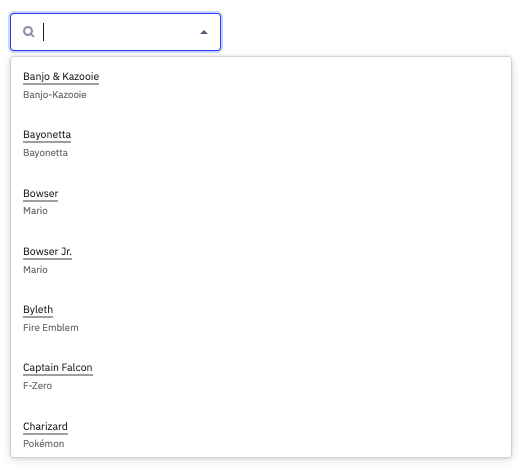
const customRenderOption = ({ value }) => {
  return (
    <div data-testid={`custom-option-${value?.name}`}>
      <div style={{ fontSize: '0.75rem' }}>
        <span
          style={{
            borderBottom: '2px solid darkgray',
          }}
        >
          {value?.name}
        </span>
      </div>
      <small style={{ fontSize: '0.7rem', color: 'gray' }}>{value?.franchise}</small>
    </div>
  );
};

const ComboboxWithCustomOptions = (props) => {
  const { description, optionToString, options, variant, ...rest } = props;

  const [currentOptions, setCurrentOptions] = React.useState(options);
  const [allOptions, setAllOptions] = React.useState(options);

  const handleCreate = (value) => {
    console.log('onCreate was called');
    if (!value) return;

    // create new array with added option
    const newAllOptions = allOptions;
    newAllOptions.push(value);

    // update all options to include new option
    setAllOptions(newAllOptions);
    // update currentOptions to include new option
    setCurrentOptions([value]);
  };

  return (
    <>
      <Combobox
        inputAriaLabel="Choose a character"
        optionToString={optionToString}
        onInputValueChange={({ inputValue }) => {
          if (typeof options[0] === 'string') {
            setCurrentOptions(
              options.filter((opt) =>
                opt.toLowerCase().includes(inputValue?.trim()?.toLowerCase()),
              ),
            );
          } else {
            setCurrentOptions(options.filter(filterObjectOptions(inputValue)));
          }
        }}
        options={currentOptions}
        variant={variant}
        onCreate={handleCreate}
        renderOption={customRenderOption}
        {...rest}
      />
      <Description>{description}</Description>
    </>
  );
};
Multiselect with AiChip
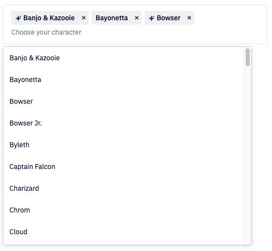
AiChip is integrated with the Combobox component for features that use a combination of user-generated and AI-generated options, to distinguish between the two. In order for options to be display as AiChips once selected, the options must have an ai property set to true. This example also demonstrates the chipSize prop, which can be used to set the size of the AiChip to small, medium, or large.
import React, { useState } from 'react';
import { Combobox } from '@camp/combobox';

// Example data structure - each option needs an 'ai' property
const teamMembers = [
  { name: 'Alice Johnson', team: 'Engineering', ai: true },
  { name: 'Bob Smith', team: 'Design', ai: false },
  { name: 'Carol Martinez', team: 'Engineering', ai: true },
  { name: 'David Chen', team: 'Product', ai: false },
];

export const MultiselectWithAIChips = () => {
  const [allOptions, setAllOptions] = useState(teamMembers);
  const [currentOptions, setCurrentOptions] = useState(teamMembers);
  const [selected, setSelected] = useState<string[]>([]);
  const [inputValue, setInputValue] = useState('');

  const filterOptions = (inputValue?: string) => {
    const searchTerm = inputValue?.trim()?.toLowerCase();
    return allOptions.filter(
      (option) =>
        !searchTerm || option.name.toLowerCase().includes(searchTerm)
    );
  };

  const handleSelect = (option) => {
    if (!option) return;

    // Reset input and options
    setInputValue('');
    setCurrentOptions(allOptions);

    // Add to selected if not already present
    const hasOption = selected.find((i) => i === option);
    if (!hasOption) {
      setSelected([...selected, option]);
    }
  };

  const handleDeselect = (optionToRemove) => {
    const newSelected = selected.filter((option) => option !== optionToRemove);
    setSelected(newSelected);
  };

  const handleInputChange = ({ inputValue }) => {
    setInputValue(inputValue as string);
    setCurrentOptions(filterOptions(inputValue));
  };

  return (
    <Combobox
      chipColor="midnight" // must use midnight for use with AiChip
      chipSize="large"
      deselectOption={handleDeselect}
      inputAriaLabel="Select team members"
      inputValue={inputValue}
      multiselect
      onInputValueChange={handleInputChange}
      onSelect={handleSelect}
      options={currentOptions}
      optionToString={(option) => option?.value?.name as string}
      placeholder="Choose team members"
      selectedOptions={selected}
      variant="filterable" // can be filterable or editable
    />
  );
};
Usage
Best practices
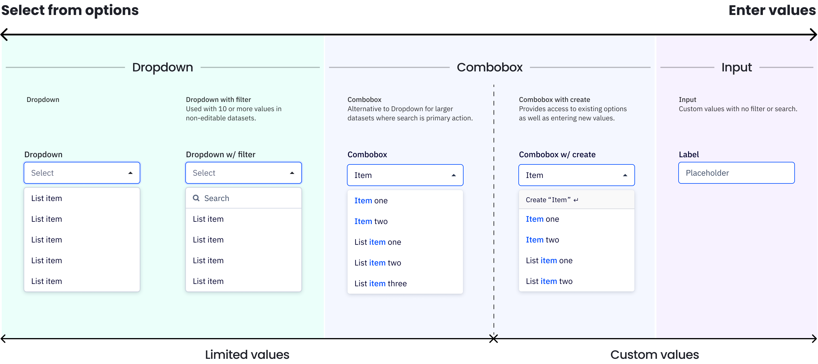
The primary action when using a dropdown is selecting an option from the list, while for the combobox it's searching for the right option. A small dataset should use a dropdown without a filter, a medium dataset can add a search field to the dropdown to filter results (i.e. a list of campaigns), and large to infinite datasets (i.e. mail addresses) are a better fit for the comboboxes.
✅ DO
- Do use in large data sets where a user is more likely to search for their option by typing than scrolling.
🚫 DON’T
- Don't use for small datasets where filtering is not needed, such as 10 items or less.
Accessibility
Keyboard support
- To open the combobox on focus, press
spaceto open the menu or start typing to search the menu - When the dropdown menu is open, use
↑or↓to navigate andenterto select an item within the list - In an editable combobox, if a user is inputting a custom input, pressing
enterwill save that input and create it as a new item Tabor (shift+tabto move backward) closes the combobox and moves focus