Skip to Content
DocumentationGuidesIntroduction

Welcome to Camp,
ActiveCampaign’s Design System.

Camp is our visual language and design foundation, uniting brand identity and platform. It empowers us to create consistent, scalable experiences across our products, with a toolkit of components, styles, and resources for designers and engineers alike.

Components

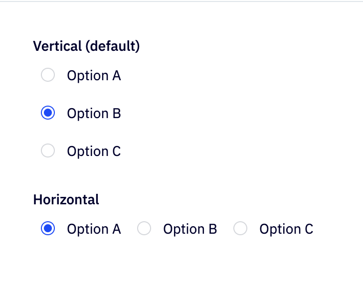
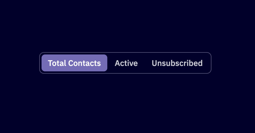
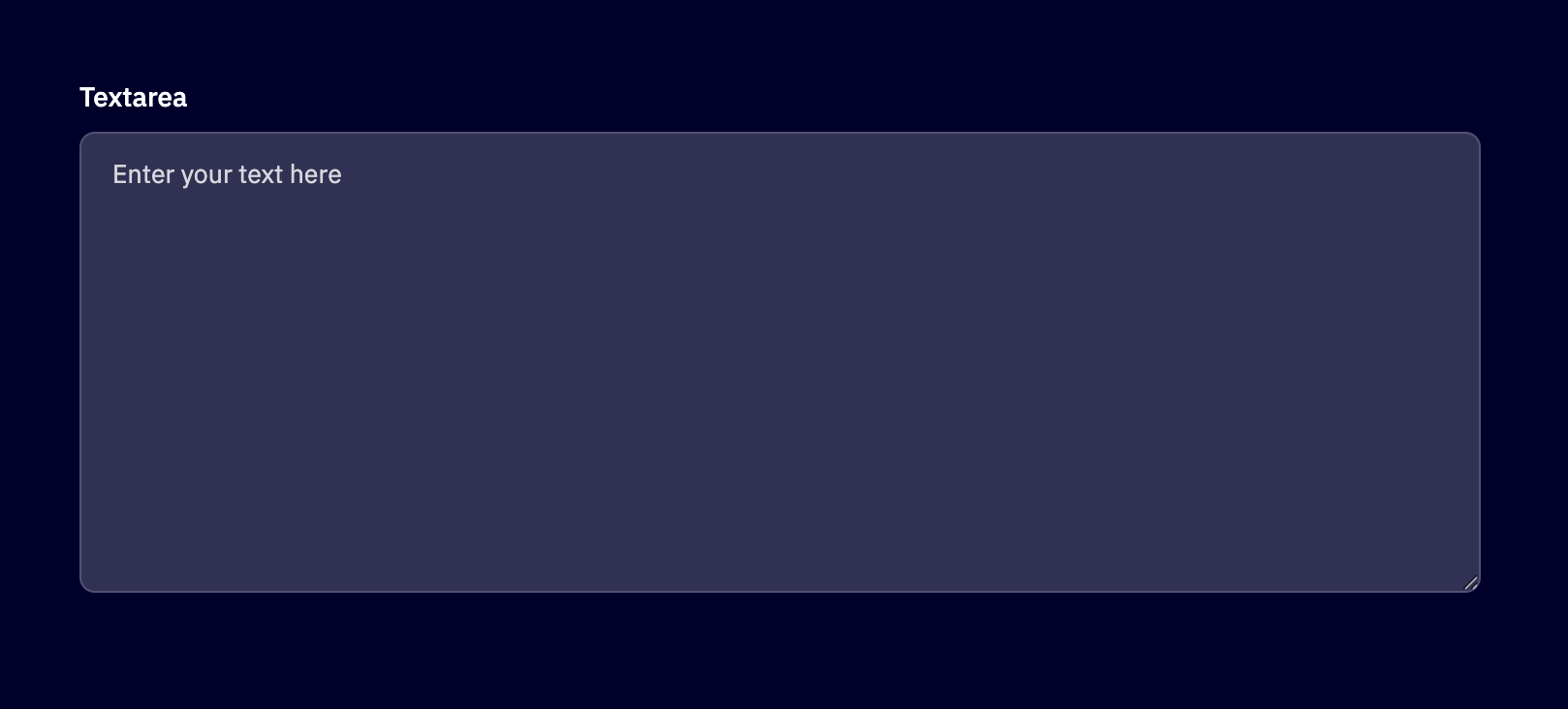
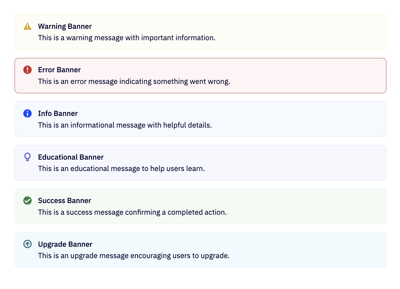
Next Gen Components 🚀

Next Generation components are sleek and extra performant, with improved developer experience and the latest look and feel of ActiveCampaign.

Banner

Banner

Displays an important, succinct message, and provides actions for users to address.

Breadcrumbs

Breadcrumbs

Indicates the current page's location within a navigational hierarchy.

Button

Button

Triggers an action when clicked.

Card

Card

A flexible container for a variety of content.

Checkbox

Checkbox

Allows users to select one or more items from a set.

Chip

Chip

Represents an input, attribute, or action.

Fullscreen Takeover

Fullscreen Takeover

A full screen modal that takes over the entire screen to focus on more complex tasks.

Icon

Icon

A small graphical representation of a program or function.

Icon Button

Icon Button

A button that displays an icon instead of text.

Link

Link

Navigational element that allows users to click through to another page or a different part of the same page.

Loading Indicator

Loading Indicator

Provides visual feedback for processes that take a noticeable amount of time to complete.

Page Header

Page Header

Popover

Popover

A transient view that shows on top of other content onscreen when requested.

Tabs

Tabs

Allows users to switch between different views or functional aspects of an application.

Text

Text

Used to display text in UI, supports various styles and options.

Toggle

Toggle

Provides simple messages about an operation in a small popup.

Tooltip

Tooltip

A small informational box that appears when hovering over an element.

Agent X Components

Agent X components are part of the new design system for the ActiveIntelligence agent app experience.

AI Button

AI Button

AI Card

AI Card

Specialized card component designed for AI-powered interfaces

AI Chip

AI Chip

Specialized chip component for displaying AI-related content and statuses

AI Data Table

AI Data Table

Intelligent data table component for displaying and managing structured data in AI-powered interfaces

AI Dropdown

AI Dropdown

Flexible and accessible dropdown component with customizable appearance and rendering options

AI Data visualization

AI Data visualization

Comprehensive suite of AI-powered charting components for displaying data insights

AI Feedback Buttons

AI Feedback Buttons

Capture quick thumbs up/down feedback on AI-generated content

AI Icon button

AI Icon button

AI-powered icon buttons for intelligent actions

AI Link

AI Link

Intelligent navigation component with AI-powered features and enhanced user experience

AI Input

AI Input

Intelligent input component with AI-powered features and enhanced user experience

AI Markdown Content

AI Markdown Content

Renders Markdown content with GitHub Flavored Markdown support and AI-optimized styling

AI Modal

AI Modal

Focused overlay dialog for important actions and information in AI-powered interfaces

AI Popover

AI Popover

Contextual AI overlay anchored to a trigger element

AI Text

AI Text

Versatile text component with predefined typography appearances for consistent design

AI Textarea

AI Textarea

Intelligent text input area for multi-line content with AI-powered features

AI Tooltip

AI Tooltip

Contextual information and guidance component for AI-powered interfaces

AI Components

These are all the components that have AI appearance variations available in development.

AI Banner

AI Banner

Currently available in Camp Next Gen

AI Button

AI Button

Currently available in Camp 1

Card (AI appearance)

Card (AI appearance)

A flexible container for a variety of content.

AI Icon

AI Icon

AI Loading Indicator

AI Loading Indicator

AI Loading Card

AI Loading Card

AI Segmented Control

AI Segmented Control

All Components

Accordion

Accordion

Displays a list of items in a collapsible format.

AI

AI

Integrates artificial intelligence features.

Avatar

Avatar

Displays a user's profile picture.

Banner

Banner

Displays an important, succinct message, and provides actions for users to address.

Breadcrumbs

Breadcrumbs

Indicates the current page's location within a navigational hierarchy.

Button

Button

Triggers an action when clicked.

Card

Card

A flexible container for a variety of content.

Checkbox

Checkbox

Allows users to select one or more items from a set.

Chip

Chip

Represents an input, attribute, or action.

Color Picker

Color Picker

Allows users to select a color from a range of colors.

Combobox

Combobox

A combination of a text input field and a dropdown list.

Date Picker

Date Picker

Allows users to select a date from a popup calendar.

Drawer

Drawer

A panel that slides in from the edge of the screen to display options or information.

Dropdown

Dropdown

Allows users to select an option from a dropdown menu.

Flex

Flex

A layout model providing a more efficient way to lay out, align and distribute space among items in a container.

Fullscreen Takeover

Fullscreen Takeover

A full screen modal that takes over the entire screen to focus on more complex tasks.

Icon

Icon

A small graphical representation of a program or function.

Icon Button

Icon Button

A button that displays an icon instead of text.

Illustration

Illustration

Artistic imagery used to convey a specific message or theme.

Input

Input

Allows users to enter text into a UI. It's a component that handles user input.

KPI Card

KPI Card

Displays key performance indicators (KPIs) to help users understand complex data at a glance.

Link

Link

Navigational element that allows users to click through to another page or a different part of the same page.

Loading Indicator

Loading Indicator

Provides visual feedback for processes that take a noticeable amount of time to complete.

Modal

Modal

A modal window creates a mode that disables the main window but keeps it visible with the modal window as a child window in front of it.

Nested Menu

Nested Menu

Categories and their list items available for selection from a popover menu.

Pagination

Pagination

Divides content into separate pages and provides navigation.

Popover

Popover

A transient view that shows on top of other content onscreen when requested.

Radio Button

Radio Button

Allows the user to select one option from a set.

Rich Text Editor

Rich Text Editor

Enables the user to create rich text using a WYSIWYG editor.

Segmented Control

Segmented Control

Displays different views or functionalities of your app that are related, yet distinct.

Skeleton

Skeleton

Provides a placeholder preview of your content before the data gets loaded.

Slider

Slider

Allows users to select a value from a range by sliding a handle.

Steps

Steps

Provides a visual representation of a user's progress through a sequence of steps.

Styled

Styled

Applies custom styles to components or HTML elements.

Table

Table

Organizes data in rows and columns, making it easier to compare and analyze.

Tabs

Tabs

Allows users to switch between different views or functional aspects of an application.

Tag

Tag

A small label used to categorize or mark special items.

Text

Text

Used to display text in UI, supports various styles and options.

Textarea

Textarea

A multi-line text input field that allows users to enter longer form content.

Toast

Toast

Provides simple messages about an operation in a small popup.

Toggle

Toggle

Provides simple messages about an operation in a small popup.

Tooltip

Tooltip

A small informational box that appears when hovering over an element.

Last updated on