Textarea
Textarea is a multi-line text input for forms and Active Intelligence experiences. It supports a default form-style appearance and an inline-edit appearance that shows content as static text and expands on focus. Install @camp/textarea.
Loading...
Overview
Resources
Install
yarn add @camp/textareaUpgrading to Next Gen
🔄 Package and export rename: Replace @camp/ai-textarea with @camp/textarea and rename AiTextarea to Textarea.
🧩 Same behavior: Labels, validation, appearance (default | inline-edit), charLimit, helperText, themed, and native textarea attributes (value, onChange, disabled, and so on) work as before.
🔆 Theming: Use the themed prop (default true) with ThemeProvider when you need light and dark support. See Styled Components & ThemeProvider.
Variations
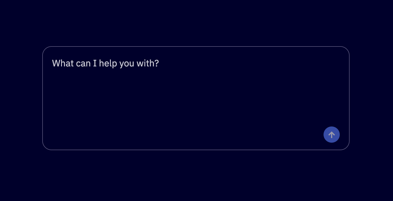
Default Appearance
The default appearance is a standard form textarea with a visible border, background, and minimum height. Omit the appearance prop or set appearance="default".
import { Textarea } from '@camp/textarea';

<Textarea label="Default textarea" placeholder="Enter text here" />;
Inline-Edit Appearance
The inline-edit appearance shows content as static text (up to two lines when collapsed). On focus, the textarea expands so users can edit. Use it for descriptions, notes, or other inline-editable content.
import { Textarea } from '@camp/textarea';

<Textarea
  appearance="inline-edit"
  label="Editable description"
  value="This content appears as inline text. Click to expand and edit."
/>;
With a custom expanded height (default when expanded is 100px):
import { Textarea } from '@camp/textarea';

<Textarea
  appearance="inline-edit"
  label="Notes"
  value="Click to edit. Expands to 200px when focused."
  height={200}
/>;
Helper Text
Use the helperText prop to add helper text below the textarea.
import { Textarea } from '@camp/textarea';

<Textarea label="Label" placeholder="Placeholder" helperText="Helper text" />;
Character Limit
Use the charLimit prop to add a character limit with a character counter.
import { Textarea } from '@camp/textarea';

<Textarea label="Label" placeholder="Placeholder" charLimit={100} />;
Invalid State
import { Textarea } from '@camp/textarea';

<Textarea label="Invalid textarea" placeholder="Enter text here" invalid />;
Disabled State
import { Textarea } from '@camp/textarea';

<Textarea label="Disabled textarea" placeholder="This is disabled" disabled />;
Inline-Edit Invalid and Disabled
import { Textarea } from '@camp/textarea';

<Textarea
  appearance="inline-edit"
  label="Invalid description"
  value="This content is invalid"
  invalid
/>;
import { Textarea } from '@camp/textarea';
<Textarea
appearance="inline-edit"
label="Disabled description"
value="Cannot edit this content"
disabled
/>;Usage
Basic Usage
The Textarea component supports labels, validation states, theming, and two appearances: default (form-style) and inline-edit (content that expands on focus). It forwards native textarea attributes such as value, onChange, and disabled for controlled usage.
import { useState } from 'react';
import { Textarea } from '@camp/textarea';

function MyComponent() {
  const [value, setValue] = useState('');

  return (
    <Textarea
      label="Description"
      placeholder="Enter text here"
      value={value}
      onChange={(e) => setValue(e.target.value)}
    />
  );
}
For inline-editable content (for example descriptions or notes that should look like static text until focused), use appearance="inline-edit". When collapsed it shows up to two lines; on focus it expands to an editable area. Set the expanded height with the height prop (default is 100px).
import { Textarea } from '@camp/textarea';

function InlineDescription() {
  return (
    <Textarea
      appearance="inline-edit"
      label="Project description"
      value="Click to edit this description."
      height={150}
    />
  );
}
Avoid using placeholder when appearance="inline-edit"; use a label or default value so the content reads as static text.
Best Practices
- Use the default appearance for form fields, long-form input, and chat interfaces
- Use the inline-edit appearance for content that should feel like editable body text (for example descriptions or notes)
- Always provide a clear, descriptive label for accessibility
- Use the
invalidprop to indicate validation errors - Prefer label or default value over placeholder when using inline-edit appearance
- Use the
heightprop with inline-edit when you need a specific expanded height (default 100px)
Content Guidelines
✅ DO
- Use clear, descriptive labels that explain the expected input
- Provide helpful placeholder text for default appearance
- Use inline-edit for content that should read as static text until edited
- Size the textarea (or expanded height) for the expected content length
🚫 DON’T
- Don’t use vague or unclear labels
- Don’t rely on placeholder with inline-edit; use labels or default value
- Don’t use inline-edit for primary form fields that need explicit focus
- Don’t make the textarea too small for the expected content
Accessibility
Keyboard Support
- Tab: Moves focus to the textarea
- Enter: Creates new lines within the textarea
- Shift + Tab: Moves focus backward
- Arrow keys: Navigate within the text content
- Home/End: Move to beginning or end of the current line
- Ctrl + Home/End: Move to beginning or end of the entire text
Screen Reader Support
- Properly labeled with accessible names
- Error states are announced to screen readers
- Placeholder text is read when the field is empty (default appearance)
- Character count and validation status are announced