AI Segmented Control
Like Radio Buttons or Tabs, Segmented Controls are used to switch between different options or views. The AI Segmented Control, also known as a “Snacktion”, offers the user the ability to toggle through various AI suggestions.
Next Generation
Overview
Usage
Best practices
- Use segmented controls to switch between contextual insights, not for performing actions.
- When space is constrained, ensure the segmented control supports horizontal scrolling.
- For ease of navigation, there should be no more than five segments per control.
- Segmented controls should not trigger navigational changes that take the user out of context. Use tabs or navigation patterns for such use cases.
- Avoid using additional icons in segmented controls unless the meaning is universally recognizable. Combine icons with labels to support clarity and accessibility.
Content guidelines
Segment labels should be clearly and consisely written, in sentence case and clear punctuation at the end. Avoid unneccessary or ambiguous words, but include articles like “a” and “the,” as they provide clarity especially in translating.
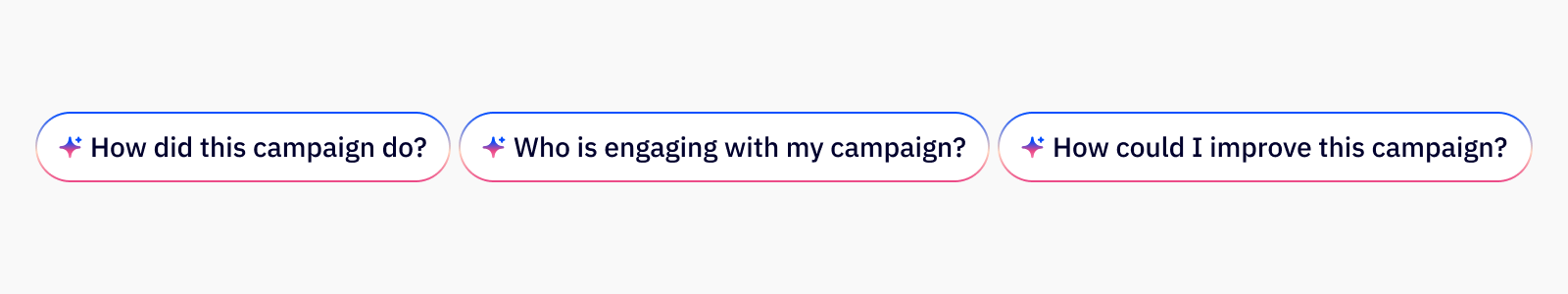
✅ DO
- How did this campaign do?
- Who is engaging with my campaign?
- How could I improve this campaign?
🚫 DON’T
- How Is This Campaign Doing?
- Who engaged with my campaign
- Improve this campaign
Accessibility
Keyboard support
- Use
tabto move focus into the segmented control group, only one segment should be focusable at a time - Use
left arrowandright arrowkeys to navigate between segments within the control - Use
spaceorenterto select the focused segment and update the view or filter accordingly - The selected segment should have
aria-checked="true"and all segments should userole="radio"within aradiogroup - Screen readers should announce the control as a single group, along with the current selection and available options
Last updated on