Segmented Control
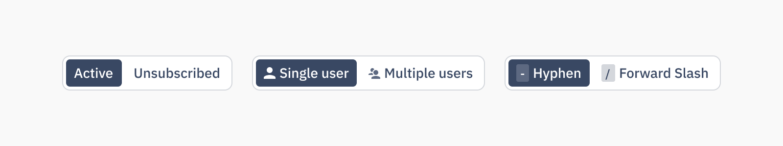
Segmented Controls are used to select one choice from a small set, and immediately apply that selection while giving the user opportunity to switch to easily switch to another option.
Loading...
Overview
Resources
Usage
Best practices
- Segmented controls should be used for toggling between views or filtering content within the same context, where options are mutually exclusive and limited in number (typically 2–5).
- They are ideal for switching between lightweight, closely related views, such as [ Edit mode | Preview mode ] or filtering a view by [ Days | Weeks | Months ].
- When the number of options exceeds five or becomes dynamic, consider using a dropdown or tabs instead to maintain clarity and usability.
- Segmented controls should not trigger navigational changes that take the user out of context. Use tabs or navigation patterns for such use cases.
- Avoid using icons alone in segmented controls unless the meaning is universally recognizable. Combine icons with labels to support clarity and accessibility.
- Do not use segmented controls when options require long labels, complex decisions, or rich media content. In such cases, use alternative controls like radio groups for better readability and interaction support.
Content guidelines
Segment labels should be clearly and consisely written, in sentence case and with no punctuation at the end. Avoid unneccessary or ambiguous words, but include articles like “a” and “the,” as they provide clarity especially in translating.
✅ DO
- [ List mode | Table view ]
- [ Locked | Unlocked ]
- [ All | In stock | Out of stock ]
🚫 DON’T
- [ Show list mode | Show table view ]
- [ Locked. | Unlocked. ]
- [ All | In Stock | Out Of Stock ]
Accessibility
Keyboard support
- Use
tabto move focus into the segmented control group, only one segment should be focusable at a time - Use
left arrowandright arrowkeys to navigate between segments within the control - Use
spaceorenterto select the focused segment and update the view or filter accordingly - The selected segment should have
aria-checked="true"and all segments should userole="radio"within aradiogroup - Screen readers should announce the control as a single group, along with the current selection and available options
Similar components


Last updated on