Color
At the cornerstone of ActiveCampaign’s color palette is Camp’s AC Blue. We support AC Blue with a palette that guides our users toward action and provides meaningful insights along the way.
Applying color
Tokens apply color in a consistent and meaningful way across the ActiveCampaign platform.
Design tokens
Tokens for color represent small, repeatable design decisions. Instead of using raw hex values, we refer to a token that describes how and where it should be used. This makes it easy to make centralized changes and continue to modernize the ActiveCampaign interface at a broad scale.
Loading...
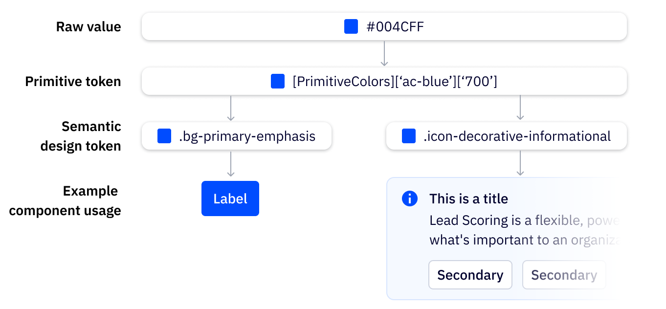
How tokens are grouped
Camp color tokens are grouped by category, property, role, intensity, and state. The further into the structure you go, the more specific the groupings become.
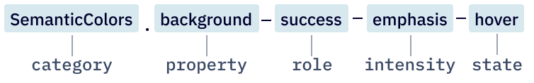
Category
Category represents a broad grouping, such as colors. Camp ships with both semantic and primitive color values, and semantic values should be used wherever possible. In development, all values within the exported theme object are semantic values.
Property
Properties are sub-divisions within the colors category that describe what the color should be applied to. The following properties can be applied to designs:
- Background
- Border
- Text
- Icon
Role
Foundational colors
Neutral midnight is used as the base of the ActiveCampaign platform. Neutral colors, denoted in our tokens as having a role of default or supportive, can be used with any property to create the base of ActiveCampaign’s UI.
eg. bg-default, bg-supportive, border-default, border-supportive, text-default, text-supportive, icon-decorative, icon-interactive
Functional colors
Functional colors communicate role with a specific meaning, including status, alerts, and actions that request attention.
eg. success, warning, danger, AI, upgrade, educational
Intensity
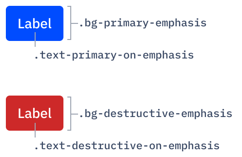
Emphasis denotes that a particular element should hold more weight, or emphasis, within the UI. emphasis backgrounds should always be paired with on-emphasis text or foreground.
The most common use cases for emphasis are Camp’s primary and destructive buttons. They utilize bright, bold background colors to grab the user’s attention.
State
State represents the current state of the element. An element may retain its property, role, and intensity with varying states.
Disabled
Tokens with the disabled state use opacity in addition to color token values to indicate that the element is not interactive.
Tokens in Development
See this page for instructions on how to use the tokens as well as a table of all the available tokens with copy/paste-ability.
Styling
See this guide for up to date styling instructions using Camp components.