Chip
Chips are text visually styled to differentiate and make it easy for users to visually parse and categorize their data. They can be used to identify statuses, categories, or other forms of metadata.
Loading...
Overview
Resources
Install
yarn add @camp/chipUpgrading to Next Gen
🎨 Updated color palette and style refresh: Aligned styling with our refreshed brand standards, delivering a modernized and cohesive look and feel.
🔄 Unified component with type prop: Simplified imports and usage by consolidating chip types into a single, versatile component with a type prop. Import chip once, and have all variations of chip available to you.
🧩 Nested component access: Allows direct access to inner components, giving developers more control over tooltips, state management, and custom interactions.
🔆 New themed prop: Allows users to enable light and dark theming for the Chip component.
More about theming here.
Previous implementation
Previously, different chip types required separate imports for each variant. You can now implement the component with a single import and the type prop as follows:
//Default Chip
import { Chip } from 'activecampaign/camp-components-chip';

<Chip color="mint">
  Chip Text
</Chip>

// Interactive Chip
import { ChipInteractive } from '@activecampaign/camp-components-chip';

<ChipInteractive color="mint">
  Chip Text
</ChipInteractive>

// Status Chip
import { ChipStatus } from '@activecampaign/camp-components-chip';

<ChipStatus color="mint">
  Chip Text
</ChipPromo>

// Promotional Chip
import { ChipPromo } from '@activecampaign/camp-components-chip';

<ChipPromo>
  Chip Text
</ChipPromo>
New implementation
You can now implement the component with a single import and the type prop as follows:
import { Chip } from '@camp/chip';

<Chip type="interactive" color="moss">
  Chip Text
</Chip>;
Prop changes
| Prop name | Old | New | Description of change |
|---|---|---|---|
dismissTooltipMaxWidth | string | Removed | This prop is no longer needed. Consumers now have direct access to tooltip component props. |
hideDismiss | boolean | Removed | This prop is no longer needed. Setting onDismiss callback will automatically show the dismiss. |
dismissButtonTooltipProps | N/A | string | New prop to apply tooltip props to the dismiss button tooltip. This prop replaces dismissTooltip |
contentTooltipProps | N/A | string | New prop to apply tooltip props to a tooltip on the chip content. This prop replaces contentTooltip |
status | N/A | string | New prop to set the status of the chip, which adjusts chip styling. This prop replaces color in the status chip. Options for status include success, warning, danger, or neutral. |
Migration steps
- Update import path: Replace the old chip imports with
Chipfrom@camp/chip. - Add
typeprop: This is optional. Use thetypeprop to specify the type of chip. Optionsincludetype="interactive"type="promo"type="status". Not specifying the type will provide the default chip styling. - Update color values: Update color values in accordance with the design. Replace old
colorvalues likemintwith the new ones (such asmoss).
Variations
Loading...
Toggle theming
Prop: themed
Type: boolean
Default value: false
The themed prop enables light and dark mode support for the Chip component. This is useful for applications that support theme switching, such as AI agent interfaces or other areas with dark mode capabilities.
When to use themed:
- ✅ If you need light and dark mode support, use
themed={true}. This is useful in AI agent interfaces or other areas with dark mode capabilities. - ❌ If you need light mode support only, themed is not required as it is set to
falseby default. This is useful in standard application areas that only support light mode. - 🔨 If light mode support is not working as expected, try explicitly setting
themed={false}(and check that your component has been updated to the latest version).
Behavior:
- With
themed={true}: Chip will respond to theme changes and display appropriate colors for light/dark modes - Without
themedprop: Chip will always display in light mode styling, regardless of the current theme
import { Chip } from '@camp/chip';

<Chip themed>Chip content</Chip>;
Default chip
There are intentionally very few differences in default chip implementation in order to make migration easy. Please note that the color options available are different now as they utilize our fresh new color palette and styling system.
Loading...
import { Chip } from '@camp/chip';

<Chip color="moss" data-testid="moss-default-chip-content" type="default">
  Chip text
</Chip>;
Interactive chip
The interactive chip makes the chip component actionable. Interacting with the chip oftentimes brings up settings related to the chip’s contents.
Loading...
import { Chip } from '@camp/chip';

<Chip color="ac-blue" data-testid="ac-blue-interactive-chip-content" type="interactive">
  Chip text
</Chip>;
Dismissible chips
Dismissible chips provide the user with an easy way to remove a chip. This is often used for filters or to remove content from a specific categorization. The onDismiss prop is required to render a dismiss button, and the dismissButtonTooltipProps prop can optionally be used to pass props to the dismiss button tooltip.
<Chip
  type="interactive"
  color="ac-blue"
  dismissButtonTooltipProps={{
    content: 'Remove this chip',
    placement: 'bottom',
  }}
  onDismiss={() => {
    console.log('Some dismiss function');
  }}
>
  Interactive Chip
</Chip>
Content tooltip
Loading...
<Chip
color="ac-blue"
contentTooltipProps={{
content: 'I am a content tooltip',
placement: 'top',
}}
type="interactive"
>
Hover for content tooltip
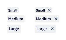
</Chip>Chip size
Default and interactive chip types can have size small, medium, or large. These chips are small by default.
import { Chip } from '@camp/chip';

<Chip color="ac-blue" size="small">
  Chip text
</Chip>;
<Chip color="moss" size="medium">
  Chip text
</Chip>;
<Chip color="midnight" size="large">
  Chip text
</Chip>;
Status chip
Status chips indicate the status of an item. Status chips can also receive a contentTooltipProps prop to pass props to the tooltip on the chip content.
import { Chip } from '@camp/chip';

<Chip type="status" status="success">
  Chip text
</Chip>;
Promo chip
Promo chips are to be used as an indication of a new or beta feature and always retain the ocean background color.
Loading...
import { Chip } from '@camp/chip';

<Chip type="promo">Chip text</Chip>;
Checkbox chip
Loading...
Checkbox chips allow users to select multiple options from a group. They are a good alternative to checkboxes when you prefer to display options horizontally.
Loading...
import { CheckboxGroup, CheckboxChip } from '@camp/chip';

const [values, setValues] = useState([]);

function handleChange(options) {
  setValues(options);
  console.log('Selected Checkbox Values:', options);
}

<CheckboxGroup
  label="Checkbox Chip Group"
  helperText="This is helper text"
  onChange={handleChange}
  values={values}
>
  <CheckboxChip value="one" label="Option One" />
  <CheckboxChip value="two" label="Option Two" />
  <CheckboxChip value="three" label="Option Three" />
  <CheckboxChip value="four" label="Option Four" />
  <CheckboxChip value="five" label="Option Five" />
  <CheckboxChip value="six" label="Option Six" />
</CheckboxGroup>;
Placement
Checkbox chip groups can be placed inline with content regularly just like a checkbox group would be. Lines should not wrap any more than three lines. If wrapping more than three lines, consider using a multi-select dropdown for your use case.
Content
Chips should be written as succinctly as possible, with no more than three words per chip, but should be clear and easy to understand. Keep in mind that chips can be much longer when translated into different languages and the amount of space the grouping takes in English may not be the same in every language.
Interaction
Like checkboxes, chips can be selected and unselected. None (if permitted), one, or multiple chips can be selected. A chip group must have more than chip in it, although it is encouraged that to make the most of the component to have at least three options in the group.
Usage
Set up ThemeProvider
The Chip component requires a styled-components ThemeProvider to be set up in your application. This is required regardless of whether you plan to use theming features. See the Styled Components & ThemeProvider guide for more details on setting up the ThemeProvider.
Note: Even if you don’t need theming support, you still need the ThemeProvider wrapper. The Chip component will default to unthemed (light only) styling, unless you explicitly set the themed prop to true.
Loading...
Best practices
- In many cases, users can define which color they want to set to represent their Label or List. In some other cases, chips have an established color that cannot be changed. By default, the slate chip is a safe chip to use for anything neutral, with the semantic color chips working well for anything that may be related to success, warning, or danger.
- Pay mind to chip placement so that it doesn’t appear to close to a button, so that it doesn’t get confused for another button.
Content guidelines
Most of the time, chip labels are defined by the user as they reflect their custom Lists and Labels. When chips are system-defined, they should be written in sentence case with no punctuation at the end, and as consise as possible.
✅ DO
-
AI generated
-
Unread message
🚫 DON’T
-
AI generated template
-
Unread Message
Accessibility
Keyboard support
- Move focus to a chip using the
tabkey, andtabagain to move to the dismiss indicator if applicable (useshift+tabto move backwards) - To interact with an interactive chip when it has keyboard focus, press the
spaceorenterkey