AI text
A versatile text component with predefined typography appearances. Use the appearance prop to apply consistent sets of typography related CSS.
Loading...
Overview
Resources
Install
pnpm add @camp/ai-textVariations
Pro tip: To view what sets of styles are being applied for each
appearancevalue, hover over theAiTextcomponent to view the full guide.
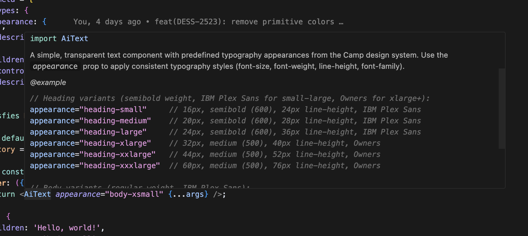
Heading variants
Heading variants use semibold weight (600) with IBM Plex Sans for small through large sizes, and medium weight (500) with Owners font for xlarge and above.
import { AiText } from '@camp/ai-text';

<AiText appearance="heading-xxlarge">Heading</AiText>;
Body variants
Body variants use regular weight (400) with IBM Plex Sans font family.
import { AiText } from '@camp/ai-text';

<AiText appearance="body-xsmall">Body</AiText>;
Eyebrow variants
Eyebrow variants use bold weight (700) with uppercase transformation and increased letter spacing.
import { AiText } from '@camp/ai-text';

<AiText appearance="eyebrow-small">Small eyebrow</AiText>
<AiText appearance="eyebrow-medium">Medium eyebrow</AiText>
Color variations
The component supports various color options through the design system’s color tokens.
import { AiText } from '@camp/ai-text';

// Direct color values
<AiText color="default">Default text color</AiText>
<AiText color="supportive">Supportive text color</AiText>
<AiText color="success">Success text color</AiText>
<AiText color="destructive">Destructive text color</AiText>

// Nested color values using dot notation
<AiText color="primary.default">Primary default</AiText>
<AiText color="secondary.default">Secondary default</AiText>
<AiText color="secondary.default-hover">Secondary hover</AiText>
HTML element variants
Use the as prop to render the text as different HTML elements while maintaining the same visual appearance.
import { AiText } from '@camp/ai-text';

<AiText appearance="heading-large" as="h1">Main heading</AiText>
<AiText appearance="heading-medium" as="h2">Section heading</AiText>
<AiText appearance="body-small" as="p">Paragraph text</AiText>
<AiText appearance="eyebrow-small" as="label">Form label</AiText>
Usage
Best practices
- Use heading variants to establish clear typographic hierarchy in your interfaces
- Choose appropriate heading sizes based on content importance and page structure
- Use body variants for readable paragraph text and descriptions
- Apply eyebrow variants for labels, categories, and supplementary information
- Leverage the
asprop to ensure semantic HTML while maintaining visual consistency - Use color variants to convey meaning and align with your content’s purpose
Content guidelines
✅ DO
- Use sentence case for most text content
- Keep heading text concise and descriptive
- Choose colors that provide sufficient contrast
- Use semantic HTML elements with the
asprop
🚫 DON’T
- Don’t use ALL CAPS except for eyebrow variants (which handle this automatically)
- Don’t mix multiple heading sizes without purpose
- Don’t use decorative colors that compromise readability
- Don’t ignore semantic markup when using different appearances
Accessibility
Screen reader support
- Use semantic HTML elements through the
asprop to provide proper structure for screen readers - Heading variants should use appropriate heading tags (h1, h2, etc.) to create logical document structure
- Ensure text content is meaningful and provides sufficient context
Replacing this component in ACF App
The AI Text component can replace existing text components in ACF App applications.
// Before (existing text component)
import { Text } from '@/components/text';

<Text variant="heading-1">Page title</Text>
<Text variant="body">Description text</Text>

// After (AI Text component)
import { AiText } from '@camp/ai-text';

<AiText appearance="heading-large" as="h1">Page title</AiText>
<AiText appearance="body-small">Description text</AiText>
Breaking changes:
- Component name changed from
TexttoAiText - Prop
typerenamed toappearance - Exclusively use
appearanceprop for typography styles. We don’t support individual style props (ie:fontSize,fontWeight, etc)