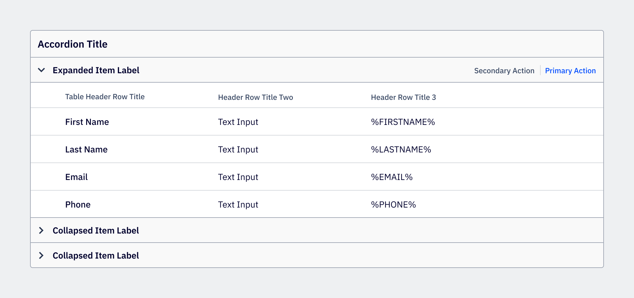
Accordion
Accordions organize content into sections, putting the user in control of what information they want expanded and collapsed.
Loading...
Overview
Resources
Variations
Accordions are useful for exposing content to users in a progressive manner. Use accordions when the content that can be collapsed is supplementary to the primary content on the page, or when vertical space is limited and there’s a need to condense content.
Default accordion
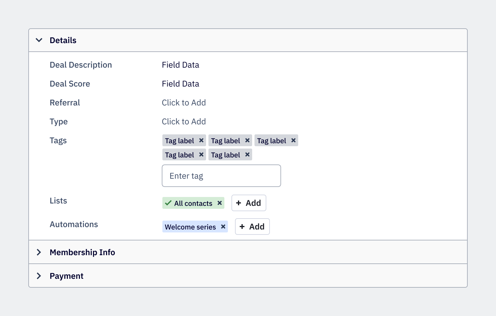
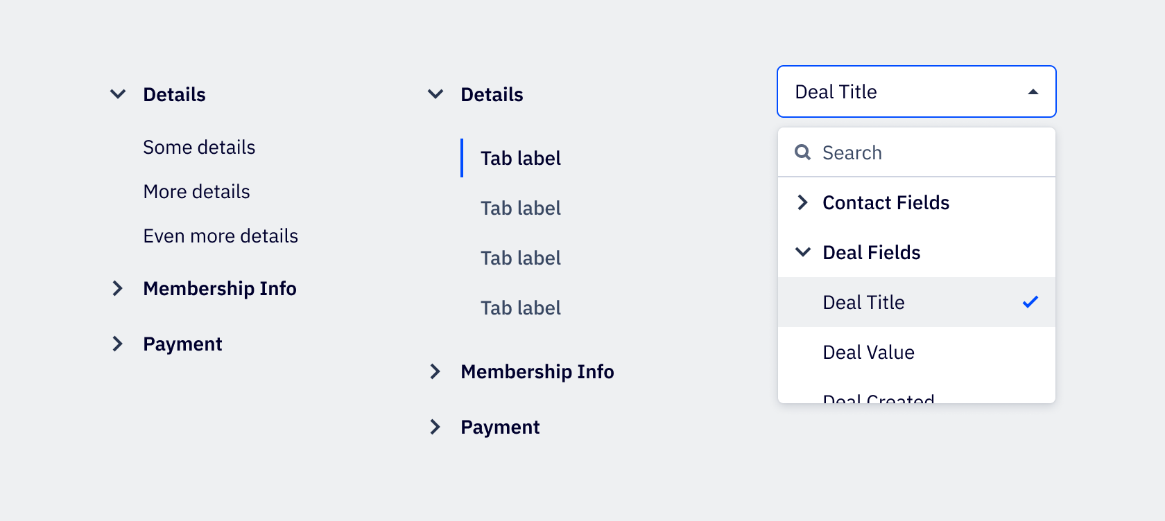
Use the default accordion wherever possible to expand and collapse content. The default accordion is used today throughout the platform on pages such as the Contact Details page. It’s also used on other Details pages, such as Accounts and Deals.
Side panel accordion
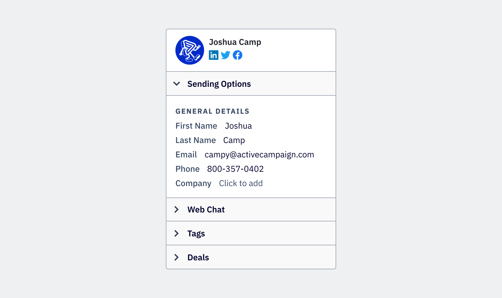
The side panel accordion is considered appearance=aside in development. It is contained within a
right sidebar. While the sidebar can vary in width, the side panel accordion always fills the width
of the side panel.
Floating accordion
The floating accordion is reserved for when space is limited and is considered borderless=true in development.
Usage
Best practices
- In most cases, the accordion’s expanded item content aligns to the label text of the accordion header. In a small accordion under 360px, the content left aligns to the expanded indicator icon.
- Accordion header should be clearly written, in title case and avoiding punctuation at the end.
Accessibility
Keyboard support
- Move focus between accordion items using the
tabkey, orshift+tabto move backwards - When the accordion item is in focus, use
spaceorenterto expand or collapse the accordion item - Interactive elements (such as a link or button) within an expanded accordion item integrate into the tab order by default