AI Button
The AI button is a representative call to action for AI inputs and interactions, making it easy for users to target and initiate use of AI within ActiveCampaign.
Camp 1
Overview
AiButton accepts all props from BaseButtonProps (with appearance overridden) and Core.Styled.Component. Valid HTML button attributes are also forwarded.
Props
| Prop | Type | Default | Description |
|---|---|---|---|
| Component / BaseButtonProps | |||
appearance | 'fill' | 'outline' | 'ai' | 'ai' | Button style. 'ai' uses the gradient border; 'fill' and 'outline' use Camp Button.Fill and Button.Outline. (Overrides BaseButtonProps 'default' | 'destructive'.) |
children | React.ReactNode | — | Content of the button. |
disabled | boolean | — | Whether the button is disabled. |
loadingIndicator | boolean | — | When true, shows loading state and replaces visible text. Button is disabled while loading. |
loadingIndicatorAppearance | 'default' | 'inverse' | 'none' | — | Appearance of the loading indicator to match the button. |
size | 'small' | 'medium' | — | Overall size of the button. |
ref | React.Ref<any> | — | Ref forwarded to the underlying button element. |
| Styled (Core.Styled.Component) | |||
as | string | React.FC | React.Component | Function | — | Element or component to render (e.g. as="a" for a link). |
className | string | — | Additional CSS class name(s). |
styles | object | — | Custom CSS styles (design tokens supported). |
dangerouslySetStyles | object | — | Custom CSS that overrides default styles; use sparingly. |
m, mt, mr, mb, ml, mx, my | string | 0 | (string | 0)[] | — | Margin shorthand (e.g. Camp space tokens or CSS values). |
p, pt, pr, pb, pl, px, py | string | 0 | (string | 0)[] | — | Padding shorthand. |
From BaseButtonProps: appearance (overridden), size, loadingIndicator, loadingIndicatorAppearance, children, ref, disabled.
From Styled: as, className, styles, dangerouslySetStyles, and spacing props (m, mt, mr, …).
Native: Any valid HTML button attributes (e.g. type, onClick, aria-*) are forwarded to the underlying element.
Resources
Install
yarn add @activecampaign/camp-components-aiImport
import { AiButton } from '@activecampaign/camp-components-ai'Usage
Best practices
- Be consistent with button placement. In button groupings and modals, the primary button should be the furthest to the right.
- While our buttons do have a disabled state, disabling a button should be avoided as much as possible due to lack of keyboard focus and low contrast. Instead of disabling the button, consider showing a banner or helper text to communicate to the user the needed information.
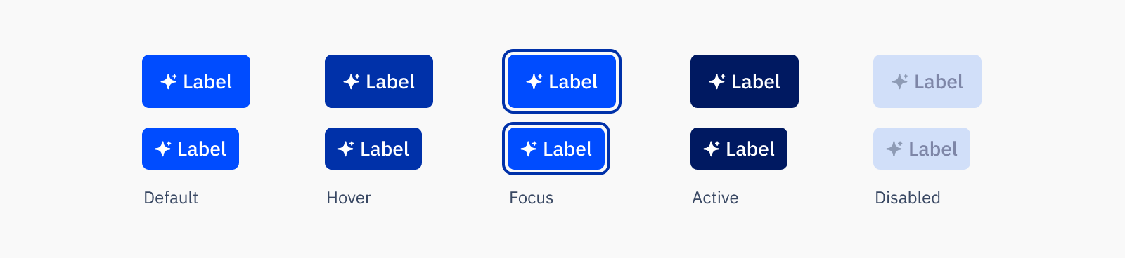
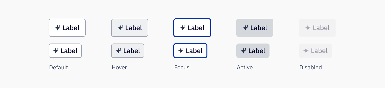
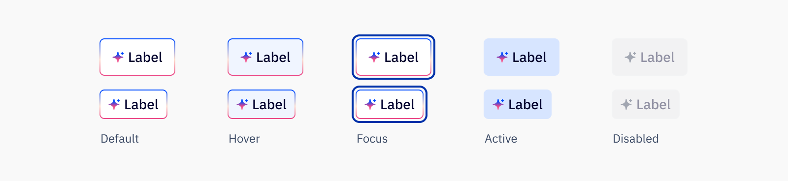
Sizes
Buttons come in two sizes, the default medium size and a small size. Which size of the button to use is based on both the importance of the action as well as the context of where it is placed.
- Medium buttons are used for all primary page actions
- Small buttons are best suited for supplementary page actions
- Small buttons can also be used in the headers of other components where height is limited
- If in groups, button sizes should not be mixed
Content guidelines
Button labels should be clearly and consisely written (no more than 3 words), in sentence case and with no punctuation at the end. Avoid unneccessary or ambiguous words, but include articles like “a” and “the,” as they provide clarity especially in translating. Use inclusive language that doesn’t discriminate from those who use assistive technology.
✅ DO
🚫 DON’T
Accessibility
Keyboard support
- Move focus to a button using the
tabkey - When the button has keyboard focus, use the
spaceorenterkey to perform action
Next Generation
Loading...
Overview

Resources
Variations
AI primary button
AI secondary button
AI gradient button
Usage
Best practices
- Be consistent with button placement. In button groupings and modals, the primary button should be the furthest to the right.
- While our buttons do have a disabled state, disabling a button should be avoided as much as possible due to lack of keyboard focus and low contrast. Instead of disabling the button, consider showing a banner or helper text to communicate to the user the needed information.
Sizes
Buttons come in two sizes, the default medium size and a small size. Which size of the button to use is based on both the importance of the action as well as the context of where it is placed.
- Medium buttons are used for all primary page actions
- Small buttons are best suited for supplementary page actions
- Small buttons can also be used in the headers of other components where height is limited
- If in groups, button sizes should not be mixed
Content guidelines
Button labels should be clearly and consisely written (no more than 3 words), in sentence case and with no punctuation at the end. Avoid unneccessary or ambiguous words, but include articles like “a” and “the,” as they provide clarity especially in translating. Use inclusive language that doesn’t discriminate from those who use assistive technology.
✅ DO
- Import my brand kit
- Generate camapaign
- Generate with AI
🚫 DON’T
- Import Brand Kit
- Generate Campaign
- Use AI
Accessibility
Keyboard support
- Move focus to a button using the
tabkey - When the button has keyboard focus, use the
spaceorenterkey to perform action