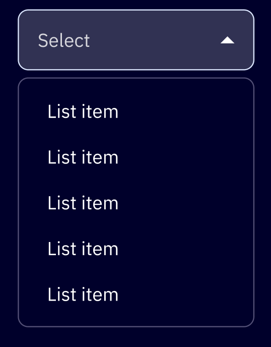
Nested Menu
A sophisticated navigation and selection component supporting multi-level nesting, inline search, form-ready inputs, and custom action layouts.
Loading...
Overview
The Nested Menu manages complex hierarchical data using a stack-based drill-down navigation. It supports deep nesting while maintaining searchability and accessibility across all levels.
Resources
Install
yarn add @camp/nested-menuUsage
Basic Implementation
Define your menu structure using the items array. Use type: 'menu-group' to create sub-levels.
import { NestedMenu, VALUE_TYPE } from '@camp/nested-menu';

const items = [
  {
    type: VALUE_TYPE.MENU_GROUP,
    value: 'Category A',
    items: [
      { type: VALUE_TYPE.SELECTABLE, value: 'Sub-item 1' },
      { type: VALUE_TYPE.SELECTABLE, value: 'Sub-item 2' },
    ],
  },
  { type: VALUE_TYPE.SELECTABLE, value: 'Standalone Item' },
];

const SimpleMenu = () => (
  <NestedMenu items={items} onSelectItem={(val) => console.log(val)}>
    <button>Open Menu</button>
  </NestedMenu>
);
Form-Ready Trigger
Use NestedMenuDropdownTrigger to integrate the menu into form layouts with labels, validation, and different visual appearances.
const [value, setValue] = useState();

<NestedMenu items={items} onSelectItem={setValue} selected={value}>
  <NestedMenuDropdownTrigger
    label="Assignee"
    labelAppearance="floating"
    placeholder="Select user..."
    renderObjectCallback={(item) => item.toString()}
  />
</NestedMenu>;
Trigger Appearances:
default: Traditional form label (supportstoporleftpositioning)inline: Compact label displayed inline with the triggerfloating: Material Design-style floating label
Form States:
// Required field
<NestedMenuDropdownTrigger label="Category" required />

// Invalid with error
<NestedMenuDropdownTrigger
  label="Category"
  invalid
  helperText="This field is required"
/>

// Disabled
<NestedMenuDropdownTrigger label="Category" disabled />

// Loading
<NestedMenuDropdownTrigger label="Category" loadingIndicator />
Item Types Reference
The items prop is a discriminated union. Each item’s behavior and available props change based on the type. Always import and use VALUE_TYPE constants.
Selectable (VALUE_TYPE.SELECTABLE)
Standard items that trigger selection.
value: The data returned viaonSelectItem.defaultSelected: Iftrue, this item is selected by default on mount.onClick: Optional callback that executes and closes the menu without changing selection state.customContent: Configuration for icons or custom render functions.hideCheck: Iftrue, hides the checkmark when selected.
Menu Group (VALUE_TYPE.MENU_GROUP)
Creates a drill-down submenu.
value: The label for the group header and back button.items: Nested array ofItemProps.hideBackButton: Removes the “Back” navigation option for this level.
Input (VALUE_TYPE.INPUT)
Renders an interactive text field within the menu list. Ideal for “Add custom value” scenarios.
value: Initial value for the input.inputProps: Configuration object for validation, submission, and prefixing (see Input Props section below).autofocus: Automatically focuses this input when the menu level is opened.
Link (VALUE_TYPE.LINK)
Renders as a standard anchor tag (<a>).
value: The link text.href: The target URL.target: Standard link target (e.g.,_blank).customContent: Optional icons or custom styling.- Note: Links do not trigger selection changes.
Section Header (VALUE_TYPE.SECTION_HEADER)
Creates a visual divider or group label.
value: The header text (can be empty for a simple divider).- Note: Not interactive - used for visual organization only.
Features
Section Headers
Use type: 'section-header' to create visual dividers or group labels within the menu.
const items = [
  { type: VALUE_TYPE.SELECTABLE, value: 'Option 1' },
  { type: VALUE_TYPE.SECTION_HEADER, value: 'Advanced Options' },
  { type: VALUE_TYPE.SELECTABLE, value: 'Option 2' },
];
Inline Inputs & Validation
The type: 'input' option supports real-time validation and custom submission logic.
import { useMemo, useState } from 'react';

const [selectedValue, setSelectedValue] = useState<string>();
const [currentInputValue, setCurrentInputValue] = useState<string>('');

// Memoize items when they contain callbacks
const items = useMemo(
  () => [
    {
      type: VALUE_TYPE.INPUT,
      value: '',
      inputProps: {
        type: 'text',
        placeholder: 'Type a custom value...',
        // Track real-time changes as user types
        onInputChange: (val) => setCurrentInputValue(val),
        // Handle submission when Enter is pressed
        onInputSubmit: (val) => console.log('Submitted:', val),
        // Handle blur events
        onInputBlur: (val) => console.log('Blurred:', val),
      },
    },
    { type: VALUE_TYPE.SECTION_HEADER, value: 'Or select preset' },
    { type: VALUE_TYPE.SELECTABLE, value: 'Option A' },
    { type: VALUE_TYPE.SELECTABLE, value: 'Option B' },
  ],
  [],
); // Empty deps - setters are stable

<NestedMenu items={items} selected={selectedValue} onSelectItem={(val) => setSelectedValue(val)}>
  <button>Open Menu</button>
</NestedMenu>;
Input Props Available:
type: Input type (text, email, url, number, etc.)placeholder: Placeholder textprefix: Text prefix displayed before input value (e.g., “https://”)validate: Function that returns error message string ortruefor validonInputChange: Called on every keystroke for real-time trackingonInputSubmit: Called when Enter is pressed (also triggersonSelectItem)onInputBlur: Called when input loses focus
Validation Example:
import { useMemo } from 'react';

const items = useMemo(
  () => [
    {
      type: VALUE_TYPE.INPUT,
      value: '',
      inputProps: {
        type: 'url',
        placeholder: 'Enter domain...',
        prefix: 'https://',
        validate: (val) => {
          if (!val.includes('.')) return 'Invalid domain format';
          if (val.length < 3) return 'Domain too short';
          return true; // Valid
        },
        onInputSubmit: (val) => console.log('Valid domain submitted:', val),
      },
    },
  ],
  [],
);
Custom Content & Right Actions
The customContent object allows for icons and secondary actions (like “Connect” buttons).
import { useMemo } from 'react';

const items = useMemo(
  () => [
    {
      type: VALUE_TYPE.SELECTABLE,
      value: 'Wix',
      customContent: {
        leftIcon: <SocialWixIcon />,
        rightContent: {
          label: 'Connect',
          icon: <ExternalLinkIcon />,
          onClick: (e, val) => handleConnect(val),
        },
      },
    },
  ],
  [],
);
Custom Rendering with renderCallback
Use renderCallback to completely customize how each item is displayed.
<NestedMenu
  items={items}
  renderCallback={(displayString, option) => (
    <div>
      <div>{displayString}</div>
      <Text appearance="xSmall" color="muted">
        {option.subtitle}
      </Text>
    </div>
  )}
  onSelectItem={handleSelect}
>
  <button>Open Menu</button>
</NestedMenu>
onClick Actions (Without Selection)
Selectable items can have an onClick handler that executes an action and closes the menu without changing the selected value.
import { useMemo } from 'react';

// Memoize items with onClick callbacks to prevent recreating on every render
const items = useMemo(
  () => [
    {
      type: VALUE_TYPE.SELECTABLE,
      value: 'Edit Settings',
      onClick: (e, value) => {
        console.log('Opening settings...');
        // Menu closes, but selection doesn't change
      },
    },
    { type: VALUE_TYPE.SELECTABLE, value: 'Normal Option' }, // Regular selection
  ],
  [],
);
Contextual Sticky Footers
Use renderMenuActions to display buttons at the bottom of the menu that change based on the nesting level or current group.
import { useCallback } from 'react';

// Memoize renderMenuActions to prevent recreation on every render
const renderMenuActions = useCallback(
  (closeMenu, { nestingLevel, currentMenuItem }) => (
    <div style={{ padding: '8px' }}>
      {nestingLevel === 0 ? (
        <Button onClick={closeMenu}>Close Menu</Button>
      ) : (
        <Button onClick={closeMenu}>Apply to {currentMenuItem.value}</Button>
      )}
    </div>
  ),
  [],
);

<NestedMenu renderMenuActions={renderMenuActions} {...props} />;
Text Wrapping for Long Options
By default, long text is truncated with ellipsis. Enable wrapOptions to wrap text across multiple lines.
<NestedMenu
  items={itemsWithLongText}
  wrapOptions={true}
  maxWidth="350px" // Constraint required to trigger wrapping
  onSelectItem={handleSelect}
>
  <button>Open Menu</button>
</NestedMenu>
Theme Control
By default, NestedMenu respects the ambient theme. Set themed={false} to force light theme regardless of the global theme setting.
// Respects global theme (default)
<NestedMenu themed={true} {...props} />

// Always uses light theme
<NestedMenu themed={false} {...props} />
Practical Patterns
Tools Menu with Connect Actions
A common pattern for integrations - combine regular options with action buttons using renderCallback.
import { useCallback, useMemo } from 'react';

// Define tools data
const tools = [
  { name: 'Wix', icon: <WixIcon />, needsConnection: true },
  { name: 'Zendesk', icon: <ZendeskIcon />, needsConnection: true },
  { name: 'Add contacts', icon: <ContactsIcon />, needsConnection: false },
];

// Memoize render callback to prevent unnecessary re-renders
const renderToolItem = useCallback((text, value) => {
  const tool = tools.find((t) => t.name === value);
  if (!tool) return text;

  if (tool.needsConnection) {
    return (
      <div style={{ display: 'flex', justifyContent: 'space-between' }}>
        <span>
          {tool.icon} {text}
        </span>
        <button
          onClick={(e) => {
            e.stopPropagation();
            handleConnect(tool);
          }}
        >
          Connect
        </button>
      </div>
    );
  }

  return (
    <span>
      {tool.icon} {text}
    </span>
  );
}, []);

<NestedMenu
  items={tools.map((tool) => ({
    type: VALUE_TYPE.SELECTABLE,
    value: tool.name,
  }))}
  searchPlaceholder="Search apps and services"
  minWidth="320px"
  renderCallback={renderToolItem}
  onSelectItem={handleToolSelect}
>
  <button>Select Tool</button>
</NestedMenu>;
Props Reference
NestedMenu Props
| Prop | Type | Default | Description |
|---|---|---|---|
items | ItemProps[] | Required | Array of menu items. |
onSelectItem | (item: T | null) => void | Required | Callback when an item is selected. |
selected | T | — | Currently selected value (for controlled component). |
search | boolean | true | Toggles the internal search input. |
searchPlaceholder | string | — | Custom placeholder text for search input. |
autofocus | boolean | true | Focuses search on menu open. |
manageFocus | boolean | true | If false, focus isn’t managed after selection (use for Lexical/Editors). |
resetMenuOnSelect | boolean | false | Resets navigation stack to root after selection. |
themed | boolean | true | If false, forces light theme regardless of global theme. |
menuHeight | { height?, maxHeight? } | — | Overrides menu window dimensions. |
wrapOptions | boolean | false | Enables text wrapping for long option text. |
maxWidth | string | — | Maximum width of the menu (e.g., “350px”). |
minWidth | string | — | Minimum width of the menu (e.g., “200px”). |
itemToString | (item: T) => string | — | Required if T is an object. Converts item to display string. |
renderCallback | (string, item: T) => ReactNode | — | Custom render function for each item. |
renderMenuActions | (closeMenu, context) => ReactNode | — | Renders sticky footer content (see examples above). |
NestedMenuDropdownTrigger Props
| Prop | Type | Default | Description |
|---|---|---|---|
label | string | — | Label text for the trigger. |
placeholder | string | — | Placeholder text shown when no selection. |
labelAppearance | default | inline | floating | default | Visual style of the label. |
labelPosition | top | left | top | Position of the label (default appearance only). |
required | boolean | false | Shows red asterisk indicator. |
invalid | boolean | false | Enables error state styling. |
disabled | boolean | false | Disables the trigger interaction. |
helperText | string | — | Text displayed below the trigger. |
loadingIndicator | boolean | false | Shows a spinner instead of the chevron. |
renderObjectCallback | (item: T) => string | — | Converts selected object to display string. |
Accessibility
- Keyboard Navigation: Full support for Arrow keys to move between items and into inputs.
- Focus Management: Automatically manages focus between search, options, and the trigger button unless
manageFocusis disabled. - ARIA: Integrated with
downshiftfor robust screen reader support.